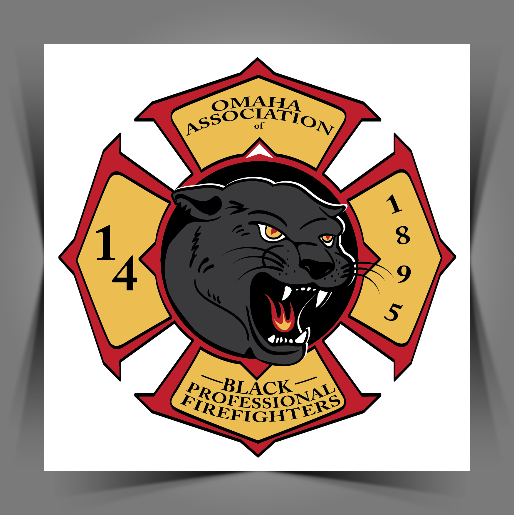
A few months ago, we were asked to take a fresh look and revamp the Omaha Association of Black Professional Firefighters North Region logo.
Jason Gentry approached us, asking if we had time to take on the project and possibly help them with it, since they didn’t really have the budget for one. We were both fortunate enough to have time available to donate, and design the logo at no cost.
We spoke with members of the association, taking notes, and listening to their stories and their importance to their history and the history of this town.
Taking this noble cause and deep purpose, bringing deeper meanings into our design, we researched and thought alot about what should be said in this design. More than just having an angry animal, sports-like logo. Sharing some of the purpose and meaning for our design:
• BATTLE PANTHER with, fire in its eyes to spot the danger of fire in the city.
• MALTESE CROSS means the traditional knights in armor to defend, protect and serve.
• FIRE in its mouth selflessly breath in and take on dangerous situations for the protection of everyone.
• NOTCHES in the panther’s ear to signify the fight and the lives lost of both firefighters and families.
• COMPASS on the inside ring around the Panther represents unity as well as pointing true North. The home of the 14th.
Meaning of the Colors:
BLACK is for strength, courage and endurance.
RED is for the protection, safety, and urgency.
GOLD is for the tried and true brotherhood and unity of the firefighters of the 14th.
It was an honor to be asked to do this, and it was an honor to work with the brave men and women of the 14th. It’s our hope that their heroism and legacy will live on, and inspire a new generation to join their cause.


